Accessible Dropdown Navigation
5th November 2023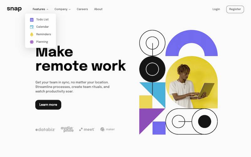
Challenge requirements
Users should be able to:- View the relevant dropdown menus on desktop and mobile when interacting with the navigation links
- View the optimal layout for the content depending on their device's screen size
- See hover states for all interactive elements on the page
Things I learned
Accessibility
I think the accessibility & screen reader experience is good on this challenge and I’ve made sure to implement the previous accessibility feedback from my other solutions.
Some points of focus were:
- Not using separate nav elements for desktop/mobile navs
- Good accessible names which aren’t overly descriptive and account for context as much as possible
- Keyboard & screen reader control of navigation on both mobile & desktop feel great and announce smoothly
- Proper placement of nav controls within nav element with respect to content
- Hiding non-essential decorative images
- Ensuring my animations had
prefers-reduced-motionrules for users who disable animations
Using Parcel
This was my first time using Parcel and it’s a lovely little build tool for these static site challenges - will definitely be using this in projects moving forward & exploring it more.
CSS-only vs using JavaScript
The greatest problem I ran into during this challenge was figuring out where to draw the line between implementing control behaviour like toggling the dropdowns in pure CSS or JavaScript.
I think a lot of opinions on progressive enhancement online can be quite polarising at most times, and it’s hard to get exposed to the realistic choices being made in production sites to figure out what “best practice” looks like.
Regardless of this, I try to build my sites progressively to ensure that a majority of users are able to use all critical functions at all times.
- I prefer CSS solutions over JavaScript if reasonable to handle cases where users have JavaScript disabled or have lower performance budgets due to their hardware.
- In cases where I need to involve JavaScript for part of a feature, I then try to get as much functionality achieved in stages starting with HTML -> CSS -> JS functionality with older browser support -> newer JS functionality.
- In cases where most of the feature’s work is done with JavaScript:
- It should fail gracefully when the user has JS disabled
- It should ideally have as wide browser support range as reasonably possible without blowing out code complexity or maintainability.
A lot of pure CSS solutions work great visually, but it seems many accessibility requirements still require JavaScript as a baseline and this doesn’t seem to be changing any time in the future.
That knowledge leaves me on a slippery slope when choosing what I bend over backwards to implement using pure CSS, or what I carry over to the JS I’m already writing for accessibility stuff like toggling aria-expanded or setting focus states.
The obvious answer is “it depends on the situation” so I’ll need to do more practice and additional reading on common progressive enhancement techniques to have more of these choices under my belt moving forward.
Layout shift issues
There were problems with CLS metrics being high due to variable hero image load times, and I struggled with this a bit before finding a decent solution.
Part of my struggle was due to incorrect usage of width/height values causing unexpected behaviour, and I was able to resolve this after a fair bit of reading and cycling to other tasks for mental space.
Another part was solved with optimisation of the image assets into jpg/webp and applying compression, and additionally learning about preloading critical images.
I’m a bit surprised there isn’t a better standard solution for preloading <picture> element sources including alternate types, but I ended up decided to preload only the WebP images as the browser support for WebP and preloads align pretty closely.
I plan on spending more time understanding CLS prevention techniques and playing around with these, but I found utilising Chrome Dev Tool’s Performance tab incredibly helpful for working through these issues.
Safari iOS border radius bug
I ran into a fun Safari bug where the outline property doesn’t obey an element’s border-radius property values, and thankfully this was fixed in Safari v16.4+.
- WebKit bug tracker discussion
- Safari Tech Preview 157 release notes containing fix
- Safari 16.4 release notes containing fix
Using SCSS nesting
I am not enjoying SCSS nesting syntax as much as I used to and I’m going to move away from using this in future, and looking at some better solutions & ways other people use SCSS responsibly.
Useful resources
- Stephanie Eckles’ article on CSS-only accessible dropdown navigations
- CSS-Tricks article on CSS-only dropdown menus
- Kevin Powell’s video on CSS megamenus
- Logrocket article on dropdown menus
- ARIA Authoring Practice Guide on accessible names and descriptions
- WIA docs on handling decorative images
- web.dev article on optimising CLS
- web.dev article on preloading
- web.dev article on preloading sources for
<picture>elements