Challenges
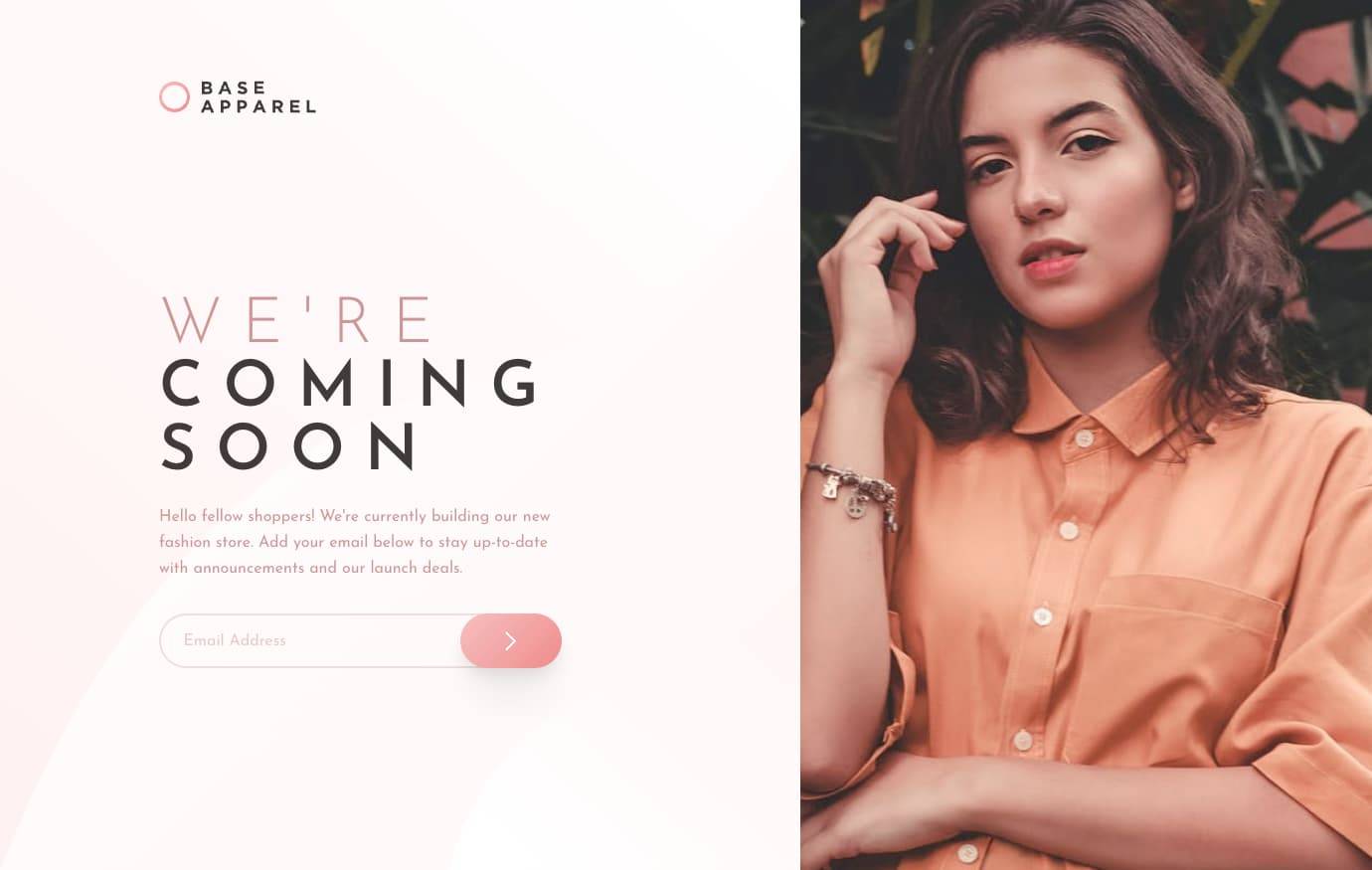
Apparel Coming Soon Page
5th February 2022
Challenge requirements
Users should be able to:- Receive an error message when the `form` is submitted if:
- The `input` field is empty
- The email address is not formatted correctly
- View the optimal layout for the site depending on their device's screen size
- See hover states for all interactive elements on the page
This was a really fun challenge that reminded me how much I love CSS Grid.
I do my best to use flexbox instead of grid for most things, but I really need to swap over to grid earlier sometimes to get a better responsive layout.
Useful resources
- .visually-hidden CSS class - This article helped with a
.visually-hiddenCSS class which visually hides elements but still allows them to be seen by screen readers. This class was used on the label for email address input to ensure screen readers are able to read this out, as only a placeholder was specified in the design.