Challenges
Skilled e-Learning Landing Page
11th April 2023
Challenge requirements
Users should be able to:- View the optimal layout for the interface depending on their device's screen size
- See hover states for all interactive elements on the page
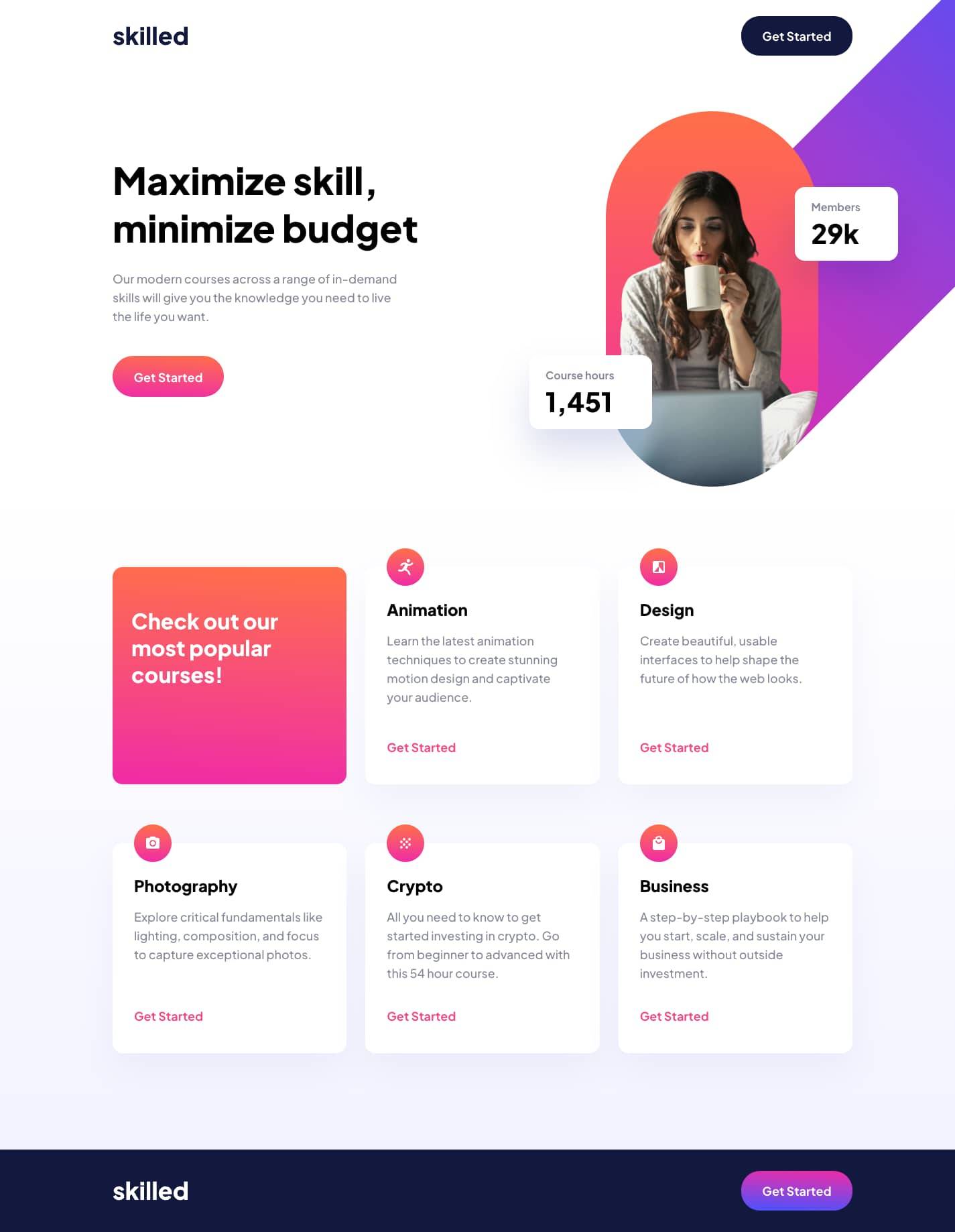
The asset provided for the mobile hero image had extra whitespace at the bottom and clipping of the box shadows which did not look great.
The tablet image also had a similar problem with the skewed rectangle being larger than required which made styling it in a responsive manner hard without small hacks.
As a result I decided to re-export the assets from Figma & build the text elements with CSS, and I think this turned out really well.