Challenges
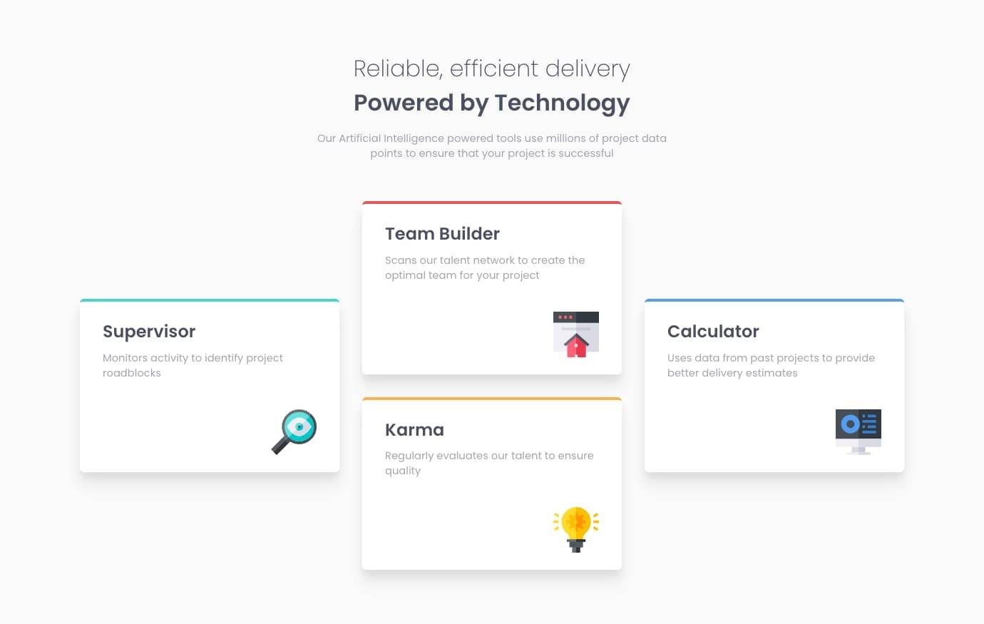
Four Card Feature Section
4th December 2021
Challenge requirements
Users should be able to:- View the optimal layout for the site depending on their device's screen size
Things I learned
Smooth box shadows
I had a lot of fun working with layered shadows on the card elements to create better looking and more consistent element shadows.
Thanks to Tobias Ahlin & Josh Comeau for their amazing resources on layered box shadows in CSS.
An example of the shadows I used for these card elements is below:
box-shadow: 0 8px 8px rgba(0, 0, 0, 0.05), 0 16px 16px rgba(0, 0, 0, 0.05),
0 24px 24px rgba(0, 0, 0, 0.02);
CSS grid shorthand
It also reminded me how much I love the grid: shorthand for declaring layout setup and grid area names:
/* Using grid shorthand to generate 3 equal columns and 2 equal rows, each with separate area names. */
/* This allows you to easily define conjoined grid areas alongside single grid items */
.card__group {
grid:
  "left middletop right" auto
  "left middlebottom right" auto /
  1fr 1fr 1fr;
}

/* Each grid item is then assigned to a grid area by name */
.card__supervisor {
grid-area: left;
}

.card__team-builder {
grid-area: middletop;
}

.card__karma {
grid-area: middlebottom;
}

.card__calculator {
grid-area: right;
}