Challenges
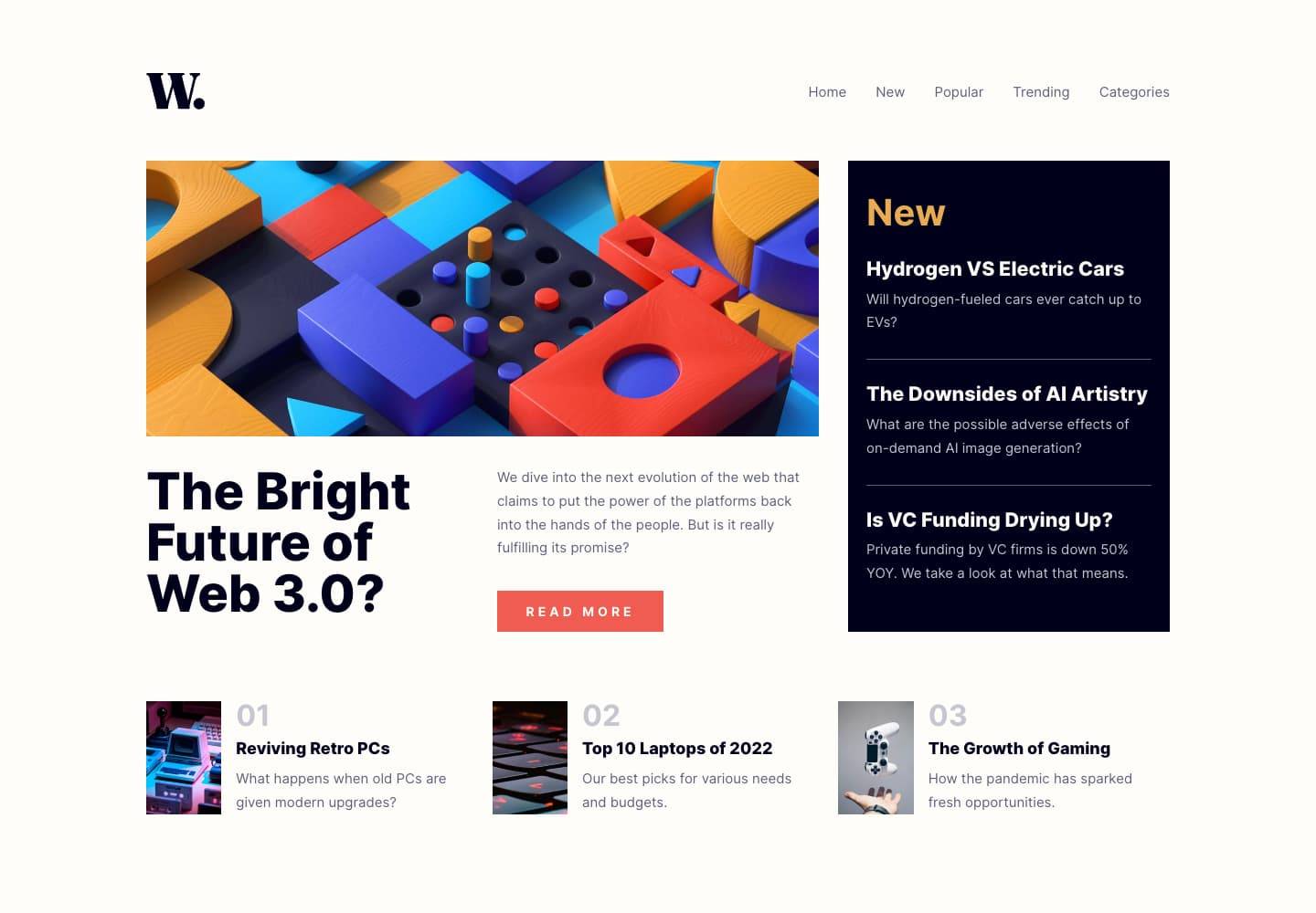
News Site Landing Page
13th May 2023
Challenge requirements
Users should be able to:- View the optimal layout for the interface depending on their device's screen size
- See hover and focus states for all interactive elements on the page
This challenge was a good chance to practice my grid skills and also start working with clamp() for font sizes more often.
My solution site is responsive on all screen sizes (including larger desktop screens) while ensuring the mobile and 1440px wide desktop layout states are as close to pixel perfect as I can get to the reference designs from Frontend Mentor.
Things I learned
I learned about a lot of accessibility points while working on my solution, a few of note are:
- Using one set of markup for mobile/desktop navigation, and putting more emphasis on styling this single element responsively rather than using separate elements.
- Adding visually hidden headings to provide accessible labels for elements without affecting the design
- Providing correct
aria-expandedandaria-controlsbehavior for assistive technologies using the mobile navigation menu - Consistently announcing lists with visually-hidden markers across browsers/SRs which treat them differently
- Gained a bit more experience choosing semantically correct heading levels and elements for “real” site content