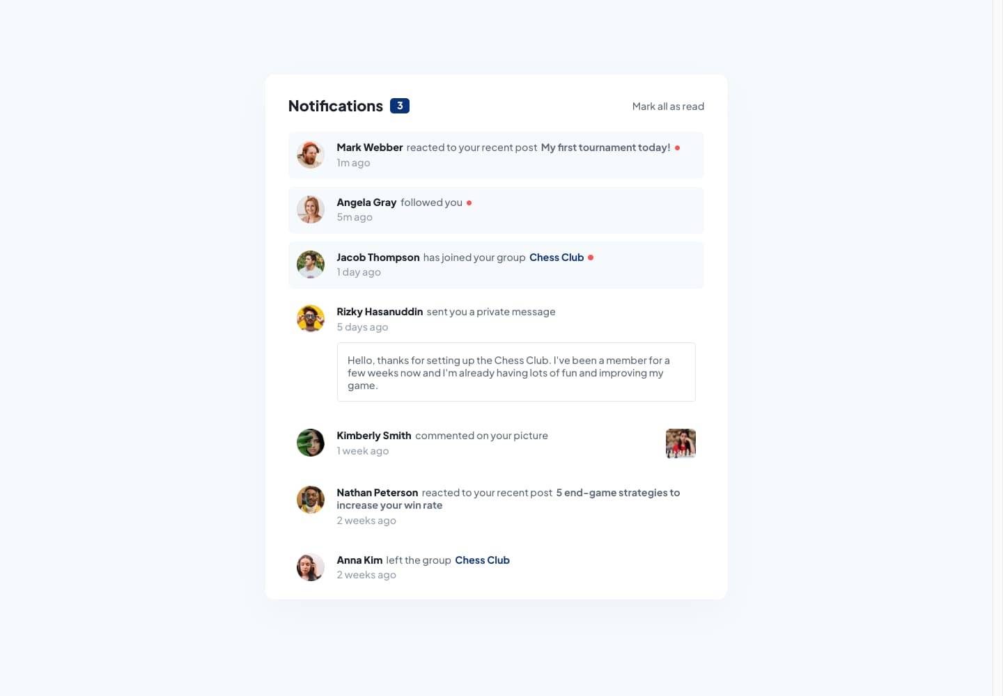
Notification Summary
4th May 2023
Challenge requirements
Users should be able to:- Distinguish between "unread" and "read" notifications
- Select "Mark all as read" to toggle the visual state of the unread notifications and set the number of unread messages to zero
- View the optimal layout for the interface depending on their device's screen size
- See hover and focus states for all interactive elements on the page
Things I learned
Parsing time into simplified strings with Luxon
This challenge design has static timestamps for each notification in the seed data provided by Frontend Mentor. I wanted this to be done dynamically, as it would in a real application.
Using the Luxon JS library, I wrote a function that takes ISO timestamps from my data or API responses, and converts them into simplified and user-readable time duration strings for each notification:
I think this functionality turned out really nice, and I’d gladly implement this in future projects & challenges. Ideally I think you should still have a hover option for the simplified display which shows greater detail into the exact time, and that is something I will do in future implementations of this.
Separate notification item components vs. a single, reusable component
I used separate components for each notification item type in this solution after weighing up the pros & cons between a single generic abstracted NotificationItem component that has internal logic to change element appearance.
I don’t think the separate component solution came out too bad, especially if you needed to design future components where the state is different without everything falling over.
I imagine when you start using these notifications in different application contexts, like within a popup or on the page outside of the notification summary, that is when the extra complexity starts to be worth it. A wrapper component which contains the switch logic I’ve used in the NotificationWindow component would be a better solution to share that across parts of an app.