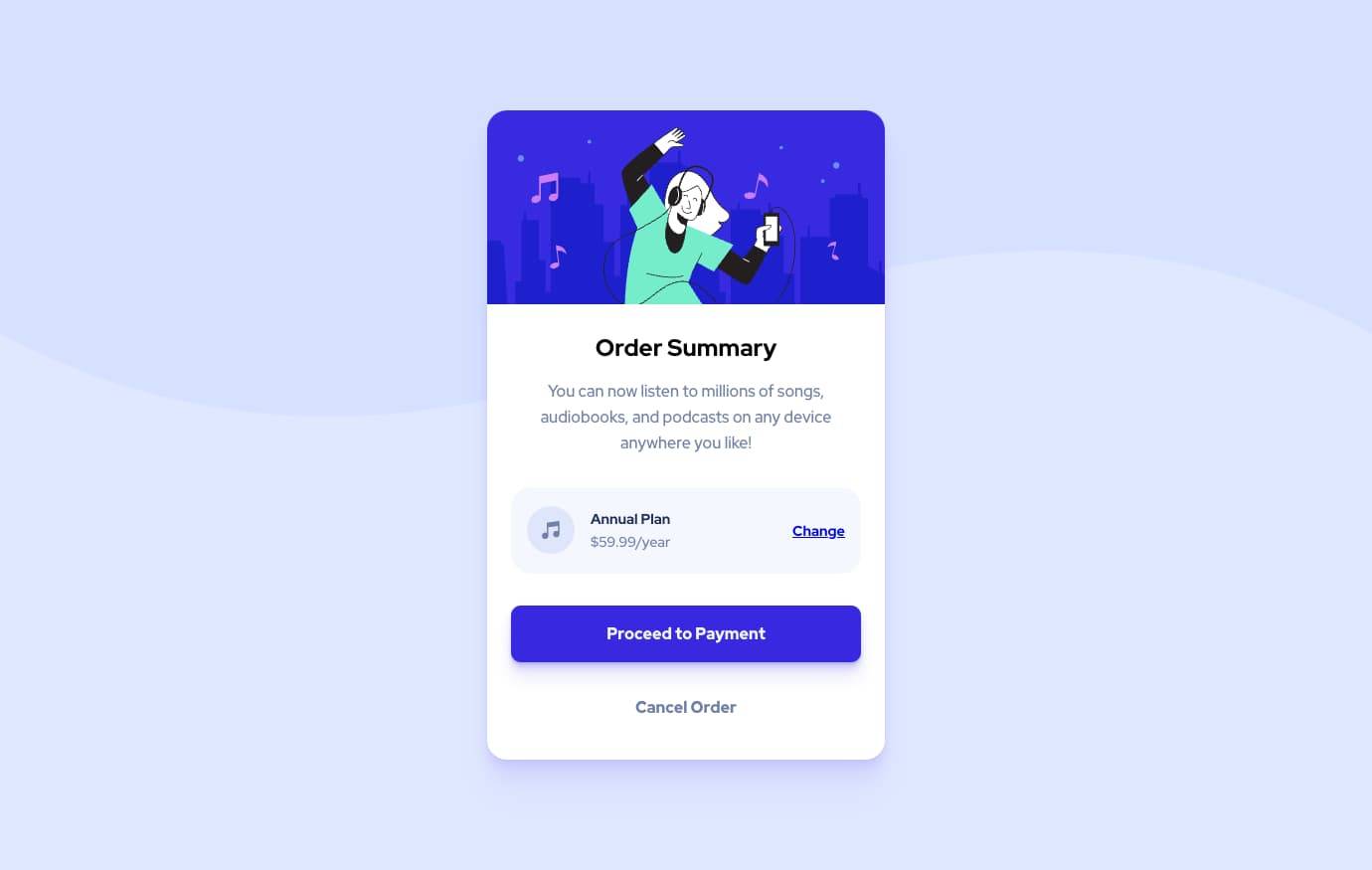
Order Summary Card
12th December 2021
Challenge requirements
Users should be able to:- View the optimal layout for the interface depending on their device's screen size
- See hover states for all interactive elements on the page
This was a fun challenge to attempt, and I ended up exploring a lot of functions within SASS while finding the lighten() function. I didn’t end up using any other SASS functions, but they seem super useful!
I think I’m not using SASS’s nesting the way it was intended - I love the idea of nesting CSS & understand the pitfalls of over-nesting and the specificity it may unintentionally apply which makes troubleshooting/reusability harder, but I feel like I’m not nesting how I should out of the “over-nesting” fear.
I feel that I was able to demonstrate more control over the spacing and sizings of a responsive component - I would like to try integrating this component into a full site just to learn more about how it would behave in a real layout.
BEM is still taking some thought to practice as I try not to overcomplicate class names, but it is definitely proving useful in easily navigating styles.
On an unrelated note, I learned how to change the message of an existing commit and re-push this through to my GitHub repo, picking up some useful but frustrating knowledge of the Vi terminal text editor along the way.