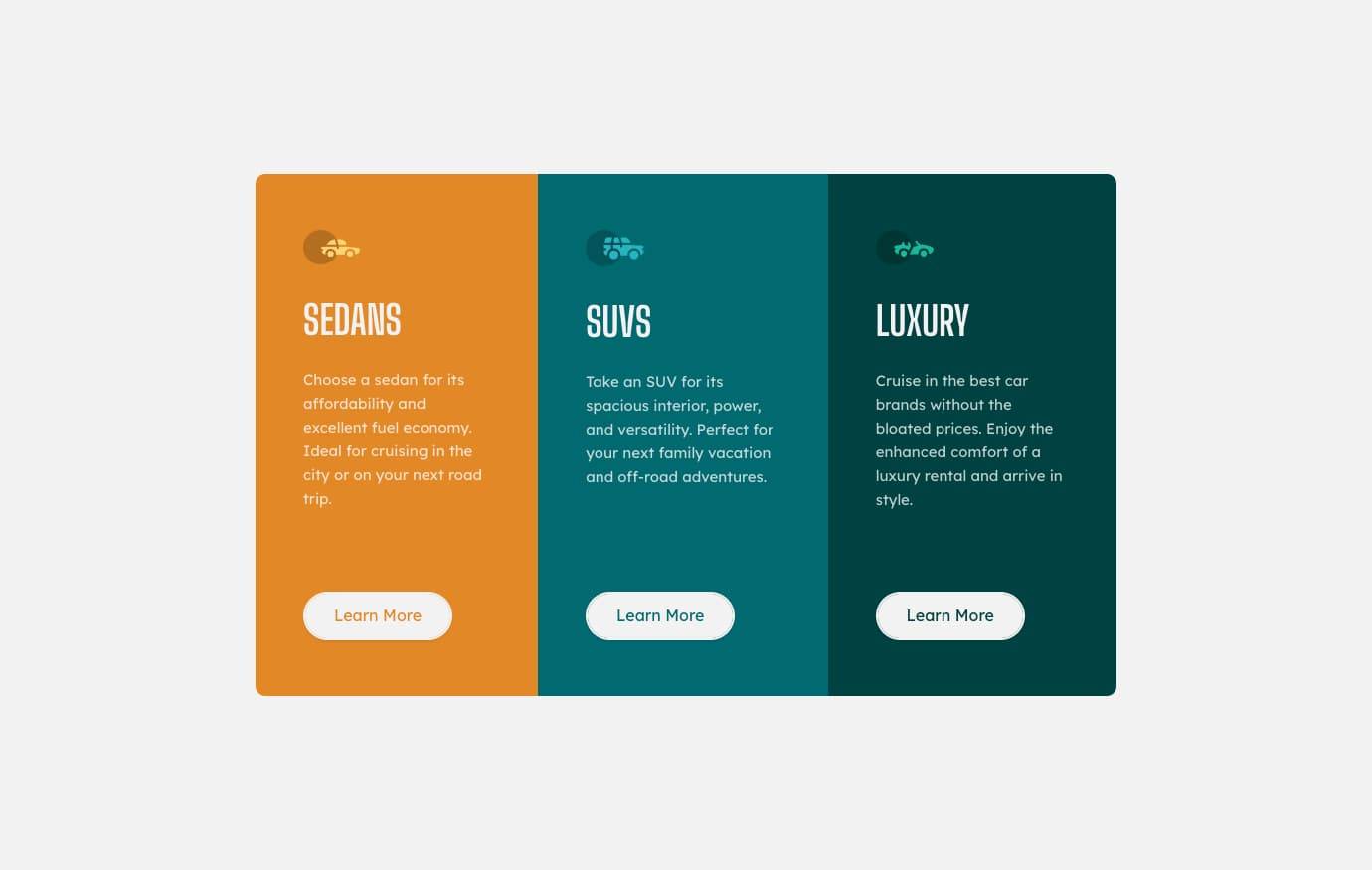
Three Column Preview Card
15th December 2021
Challenge requirements
Users should be able to:- View the optimal layout for the interface depending on their device's screen size
- See hover states for interactive elements
Things I learned
Sass’s ampersand operator
I think this has made the implementation of each specific card class and associated hover styles much more readable. Previously I would have structured it as follows:
.card__container {
...;
}

.card__container-sedans-card {
...;
}

.card__container-suvs-card {
...;
}

.card__container-luxury-card {
...;
}
Now I have structured it:
.card__container {
...;

&-sedans-card {
  ...;
}

&-suvs-card {
  ...;
}

&-luxury-card {
  ...;
}
}
Correcting a wrong understanding of y-axis margins
A small challenge was when I experienced an issue with the cards in desktop layout, where wrapping of the card copy text would cause misalignment of the card buttons.
I knew that I could flex the card container in column direction, and then apply something to force push the buttons to the bottom of the card, but I believed that I could not use margin: auto on the y-axis due to an incorrect piece of information I read previously.
After some perseverence and googling, I was surprised to find that I can indeed utilise auto margins on y-axis. Cool as! I was then able to resolve with the below solution:
- Apply flex to the card containers in column direction
- Set card
height: 100%to force matching of container height - Applied
margin-top: autoon the card buttons to force them down to bottom of the container, resolving the problem.
Acknowledgements
Thanks to @Robert-Rynard on Frontend Mentor for suggesting a better solution for the overall border curvature.
I moved to applying border-radius: 10px and overflow: hidden to the .page__container card parent element, rather than specifying different radius values for the first and last card (which then needed adjustment in media query).